Leading product design at a tech startup
I joined FanThreeSixty in 2015 as the only product designer at a small tech startup. At that time our mobile app was a built in a fixed template that served five clients across four different professional sports. Over the next five years, we scaled the same app to host more than fifty clients and dozens of sports with a fluid content system navigation structure, and earned an average 4.5 star rating among users.
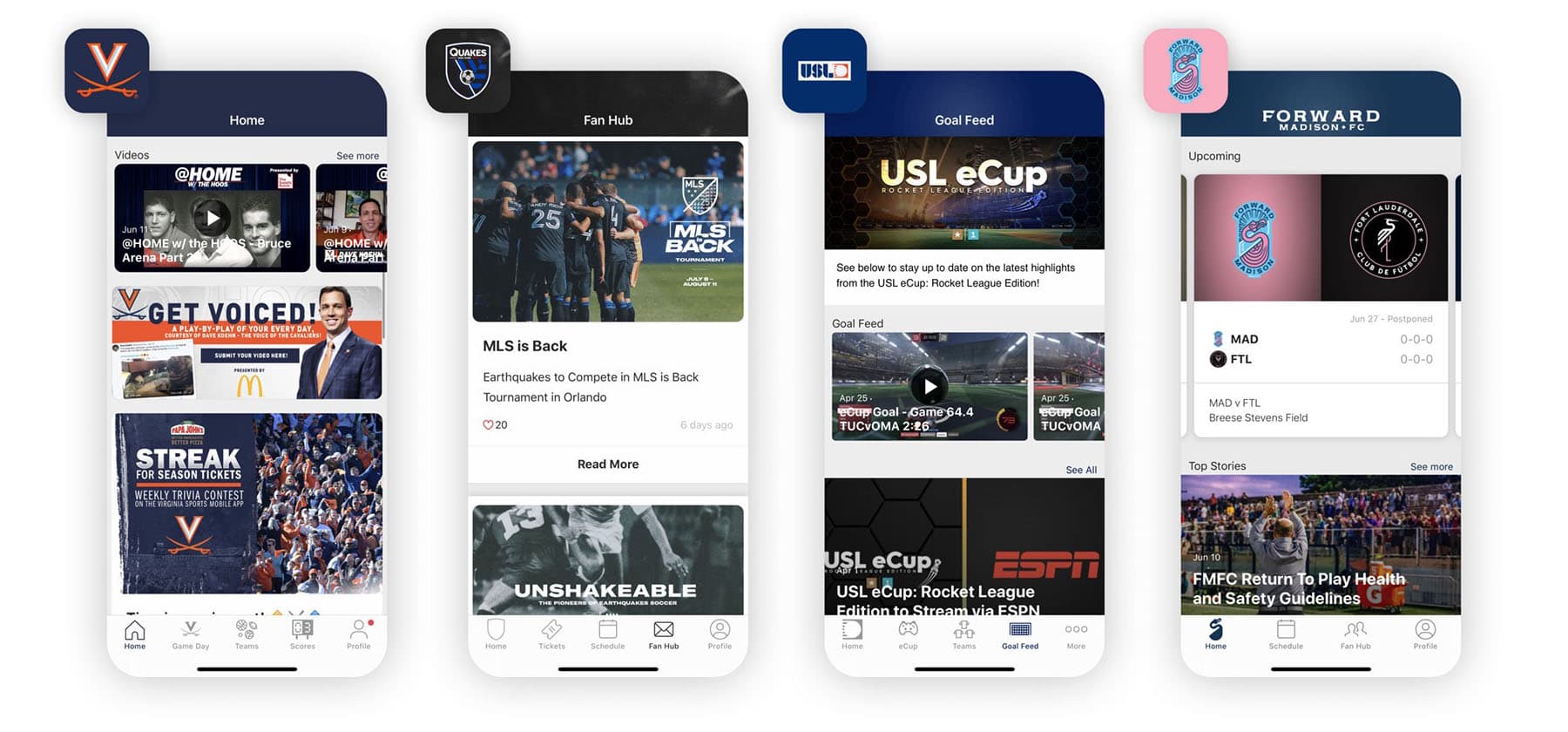
After many years of focused product development, our mobile app supports professional, collegiate and high school sports.
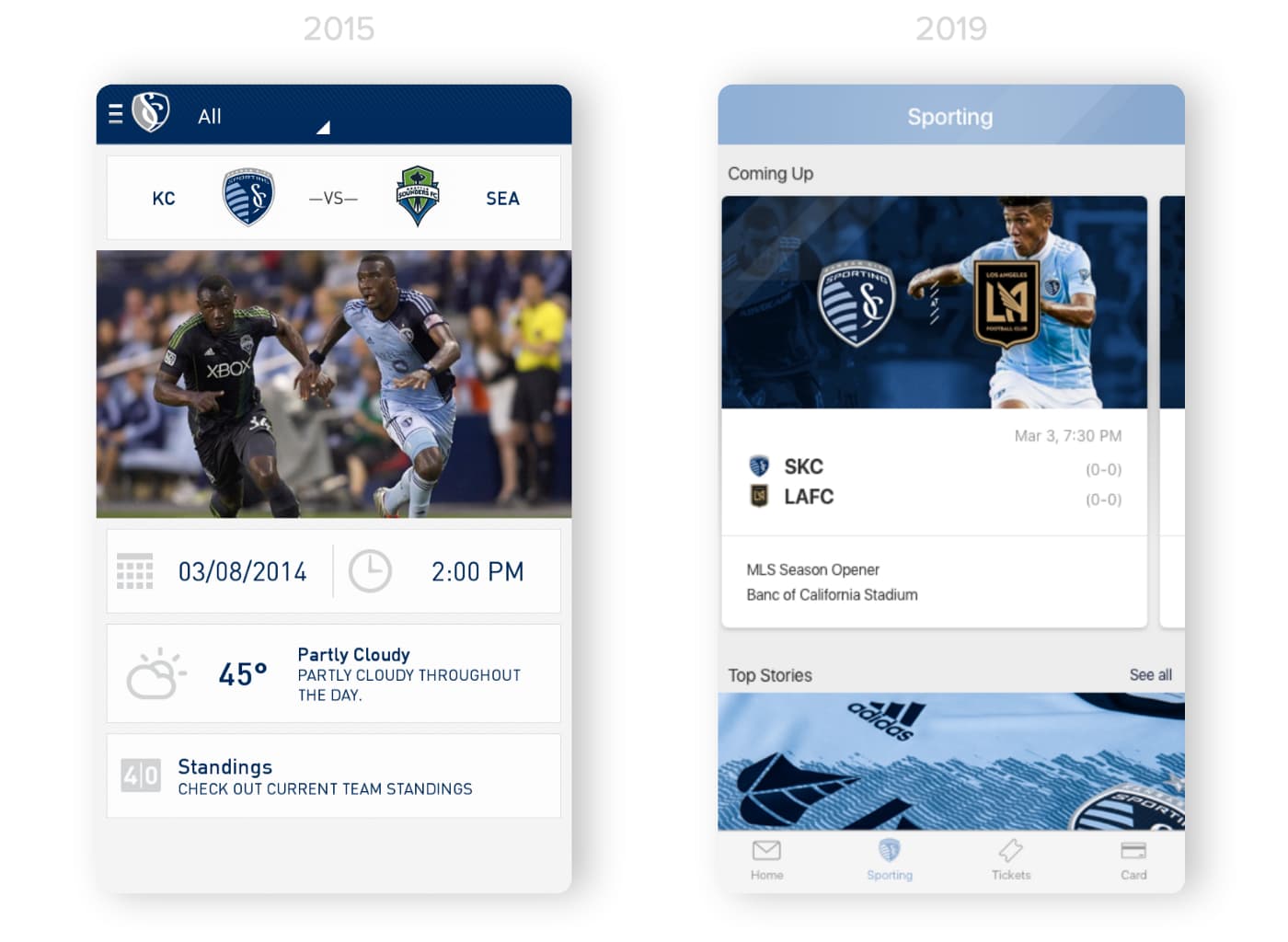
UI inevitably changes over time as it follows the current of technology. We trended towards more flexible UI elements and configurable modules to adapt to a wide range of client and devices.
Breaking up the template
When I joined FanThreeSixty, our first order of business was to move towards a more fluid navigation that could flex to each client’s needs. In a matter of weeks, I was able to visualize where we needed to go with a simple Invision. The artifact helped build trust and alignment between the engineering, product and leadership teams. While the updates were fairly simple to visualize, executing the technical aspects required 18 months of development to enable.
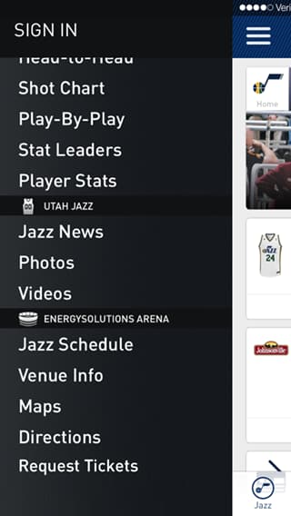
Originally, this menu navigation required an app update. We quickly learned that clients wanted to update navigation on the fly, which we accomplished with an auto-updating configuration file.
Artifacts beat requirements
As I iterated within the product team, I found prototyping as the most effective practice to communicate ideas and gain a shared understanding. A simple prototype allowed for better conversations and reduced assumptions within the team.
This method required a shift in the company’s culture away from a heavy emphasis on business requirements, complicated user stories and multi-page technical documentation (waterfall habits). Over time, the team became more reliant on prototypes as the reference point for UI development efforts.
Translating the craft
There are so many great tools to visualize UI. For mobile app prototypes, we used Invision, Flinto, Figma and even After Effects to visualize our ideas. For responsive web, we used HTML/CSS to render our ideas in the browser.
As the design team matured, we worked more closely with engineers in their native languages to ensure our designs were built to the exact specifications we intended.
Once we started rendering our designs with HTML/CSS, the engineering teams translated our design into production-ready code faster and more accurately than ever. Additionally, designers were able to modify the code base with autonomy. This was very empowering for the design team and accelerated development.
User testing
When it comes to qualitative testing, Invision prototypes are our most reliable form factor to perform research. Our best research is usually done in person, where we have a one-on-one conversation with users and watch them tap through a prototype on their own device. My favorite question to ask when a user gets stuck is “what do you expect?”
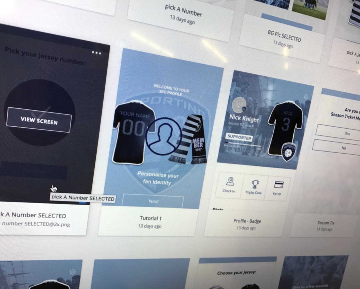
Invision prototypes are our most reliable form factor to perform research.
Live stats are hard
The hardest element of building sports apps are live events. Continuous maintenance is required to enable live scores and stats from various feeds and APIs. Additionally, the user’s expectations are unrelentingly high, thanks to a wave of mass market sports app and Twitter (a high bar).
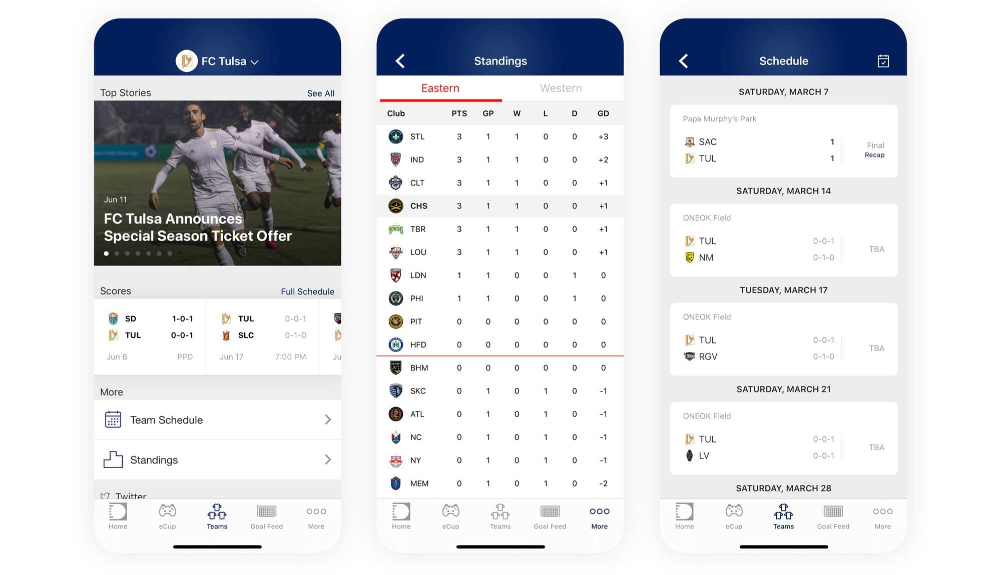
Each sport comes with a set of statistical elements and presentation quirks, which is true a challenge to maintain at a small tech company.
Patience and perseverance
When I started working on a product team, I was struck by the patience it required as a designer. I came from an agency background where projects ranged between three and six months and required less engineering coordination. While it was fairly easy to layout a roadmap for UI/UX, the continuous balance between new work, maintenance and other roadmap items competed for attention on the backlog. As a designer, I have found it is best to have a few projects to juggle in order to optimize my time and energy.
⭐️️️️⭐️️️️⭐️️️️⭐️️️️⭐️️️️ I’m most proud when our users give us a high rating in the app store. Making users happy brings meaning and satisfaction to the work of product building.