Simplifying the
sign‑in experience
With an updated design system for the FanThreeSixty web app, our final UI update was the sign-in screen, which I like to call the “front door” of the app. Here’s an overview of how I completed the project.
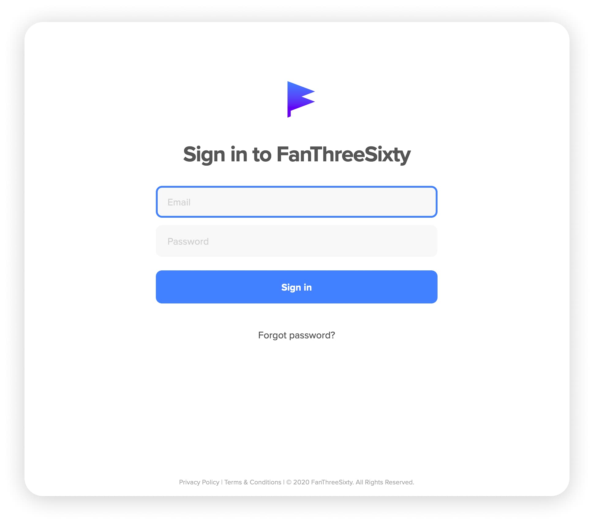
Our final UI for the updated sign-in screen
99% Invisible
The best thing a user might say about a sign-in screen is that they don’t remember it.
Romans Mars (one of the best voices in podcasts) says that good design is 99% invisible. A sign-in screen the perfect example of this design paradox. A sign-in screen appears trivial at face value, but it carries invisible importance upon further reflection.
The sign-in screen gives users a first impression of your software. The craft, or lack thereof, of the screen signals to users what they can expect for the rest of their digital experience with you.
Reducing Distractions
Our main goal for the sign-in screen was to drastically simplify the visual design. We wanted to elevate the primary task of the screen while updating the UI to our new design system. The previous screen dedicated 60% of the page for marketing and had seven different font styles (yikes!).
While we liked the visual aspects of the original layout, we decided it was more important to focus the user on their next task:
Signing in.
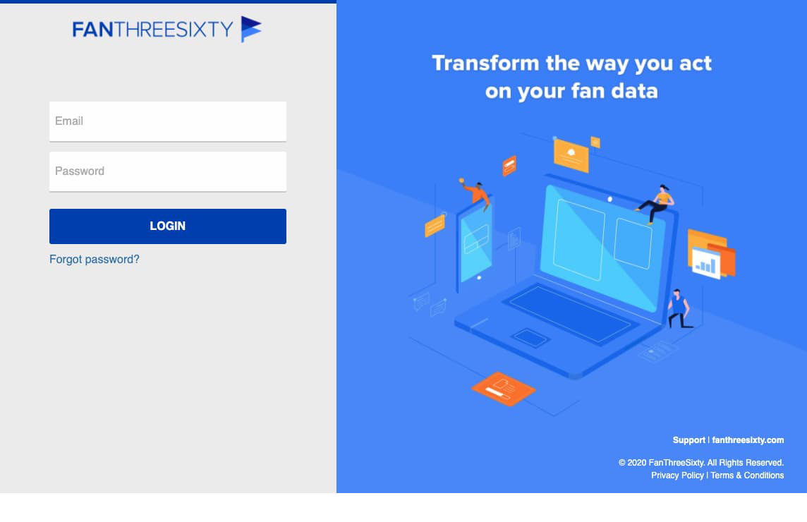
Original sign-in screen
As we dissected the existing screen, a major gap revealed itself (this seems obvious upon reflection) — we didn’t actually communicate the task for the user. The only visual cues were “FanThreeSixty” and “Transform the way you act on your fan data” and a button that says “Login”.
Simple and Obvious
Instead of relying on our primary logo in the header, we simplified the branding to an icon and a more obvious message for the user: “Sign in to FanThreeSixty.” Additionally, we added a heavy border to highlight the active input for the user. Simple and obvious is a design principle we follow at FanThreeSixty.
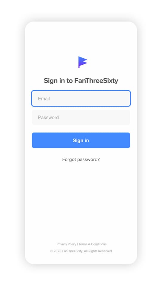
Mobile version of sign-in screen
Mobile Considerations
After resolving the content for the page, we added some final touches for mobile views and compatibility. First, we ensured the typography correctly scaled down for smaller screen sizes. Secondly, we designed the content to fit above the mobile keyboard, so the user could see the entire form within the viewport.
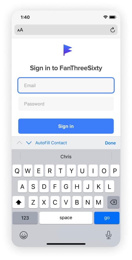
The keyboard, along with browser chrome consumes about 60% of the viewport.